Years ago, Eddie Maestri’s clients purchased one of his first renovation projects in Dallas, so when they stumbled upon their newfound dream home, a 1931 Tudor with fairy-tale charm in Lakewood’s Conservation District, they knew they could trust him to restore it. By this time, Maestri had established a successful architecture, interior and landscape design firm — among other successful artistic endeavors — all bearing his name.
He arrived to find the home had an addition dating back to the ‘90s. “It wasn’t bad, it’s just that it was done at the time, for that style. So when our clients approached us with this house and what they wanted to achieve, we decided to tear off a lot of that addition and rework it,” he says. Thankfully, there was also a lot to work with in the home, including wood paneling in a beautiful stain, rich red oak flooring and unique Tudor Gothic details the clients loved.
“They wanted the house to feel like a classic home with a timeless feel, and to pull inspiration from different places they had been — a little bit of California, a little bit of New York. For example, in their parlor, we used a high-end hotel feel. We wanted a mix of dark and moody, and then also a mix of really light and bright spaces.”
With reverence not only for the original 1930′s architecture of the home, but for the conservation district, Maestri and his team had lofty plans right from the start. “The biggest thing was that we wanted the house to have even more character than it originally had. Everything we did we used as an opportunity to pay homage to that period. The goal was for it to feel original, and to really respect the district.”

In order to obey the guidelines of the conservation district, the home’s front elevation had little more than cosmetic updates. “The client wanted to paint the brick, which I know can be a little controversial. Essentially, it was very dark in front of the house. They wanted the whole thing to be updated and feel fresh, so all of the brick and trim was painted,” Maestri says. “We did a brand-new front door with the leaded glass, then added the gas lanterns.”

As the starting point for the whole home, Maestri completely reconfigured the first floor and redid the kitchen to serve as the central heart of the home. “The goal was to use a lot of the original details in the house, like the Gothic arches,” he says.
That meant doing away with the remnants from that 1990s reno. “We wanted everything we did to have longevity and an authentic feel, so we avoided things like using can lights. Overall, we knew the kitchen should feel like it had always been there.”
Custom cabinetry, including new leaded glass doors, conceals the refrigerator and provides a place to stash modern-day kitchen essentials. Maestri also added a few vintage touches. “We did an antique mirror backsplash. It’s opposite French doors to make the space feel bigger, but also to bounce that light back into the kitchen,” he says.

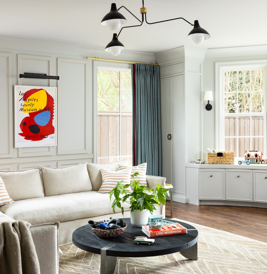
Updates in the family room included a new Tudor Gothic-shaped mantel, built-in shelving and French doors to bring in natural light. “It’s a little bit more casual, cozy but still chic,” Maestri says. He painted the room and much of the house in Sherwin-Williams Alabaster, designed a custom sofa and reupholstered the client’s existing wicker chairs and pillows. A Samsung frame TV doubles as art.

The clients also asked for a covered outdoor living area, a feature that can create a bit of a challenge for designers. “Adding a porch to the back of a house is kind of a double-edged sword because you lose a lot of natural light,” Maestri says. As a solution, he added three sets of French doors and got creative with the covering. “We wanted something that wasn’t as heavy as a porch roof, something a little more delicate, so we added the awning,” he says. “It also gives the space a nostalgic Beverly Hills flair and a little more character.”

In the front of the house sits a room designed for entertaining adults, with a large bay window providing natural light from the front of the home. “We wanted this space to feel collected, a little bit like a high-end boutique hotel lounge. So we set up the room to have a couple of different seating arrangements,” Maestri says. “It already had the wood paneling on the wall, and we loved that. We wanted to keep that and make it an original feature. And then in this room in particular we went with the dark and moody route,” he says.
A new powder bath added during the renovations includes heavy moldings and a custom vanity. “We went a bit more formal in that space, but also wanted it to feel nostalgic,” Maestri says.

Maestri went to great lengths to ensure the new addition seemed original to the house. In the stairway, he added a door with the same Tudor Gothic shape seen throughout the home. “It was such a unique, interesting detail. We wanted to really bring out the details throughout the house so you wouldn’t be able to tell what was done in the 1930s versus now,” he says.

During the renovation, a bump out on the side of the house created space for a sophisticated butler’s pantry that sits between the kitchen and dining room and doubles as a home bar. Maestri designed custom shelving for adult beverages and painted the space in a dramatic contrast of Sherwin-Williams Mount Edna and Silverpointe.

