Over the past 20 years, designer Alexis Pearl has honed the creative process she uses to capture her clients’ personal style and dream-home vision. But planning her own living space after purchasing a lot in Park Cities proved more challenging than she expected.
“It was hard to figure out how I wanted to live in my own house,” shares Pearl, owner of Alexis Pearl Design, which serves high-end commercial and residential clients in the greater Dallas area. Pearl’s husband also wanted to be actively engaged in the process, much to her surprise — “I just figured I would design it, and he would show up,” she says jokingly — and asked to see a traditional client presentation to better understand her plans for each room.
Eventually, though, Pearl’s husband let her have free rein. The result was an inviting, kid-friendly abode with a transitional design that can stand the test of time.

The 4,500-square-foot home features four bedrooms and four-and-a-half baths, with cozy nooks where the family can relax, and roomy spaces indoors and out for larger gatherings. The layout was inspired by a floor plan by Dallas architect Brian S. Easley, with whom Pearl had worked in the past. She chose Brooke Bailey Custom Homes to do the construction.

“We design most of our projects with clients who have children. People really live in our houses, and a big focus for me is comfort,” says Pearl. To this end, she wanted to create a relaxed living space where she and her husband could unwind and enjoy quality time with their two daughters.
“I like living in more muted color, with texture and natural materials,” notes the seasoned designer. “We did a lot of white oak, and there are a lot of natural wood tones.”
The bedrooms all are upstairs; downstairs, the dining room, library and home office are at the front of the house, while the living room and kitchen are in the back. A well-appointed butler’s pantry connects the kitchen and dining room and includes modern amenities, like an undercounter refrigerator and dry wine storage cabinet. “We have a date night every Friday, and we’ll always have a drink before we head out,” says Pearl.

The custom cabinets feature a quartzite countertop in Amazon Pearl by Walker Zanger, and Pearl extended the backsplash with black subway tile from The Tile Shop to the ceiling to make the passageway feel roomier. A Goodman petite hanging shade pendant light by Thomas O’Brien, sourced from Visual Comfort, adds elegant task lighting over the sink.
Although some families reserve the formal dining room for special occasions, Pearl focused on furnishings that were as practical as they are beautiful for her own home.
“We actually eat there all the time,” she says, noting that she chose a durable wool rug and performance upholstery from Fabricut for the custom dining chairs. “I’m not afraid of spaghetti falling on anything,” she adds with a laugh.
The dining table was also custom made, and the couple commissioned the artwork hanging above a modern black credenza from Bliss Studio. “I knew I didn’t want to do wallpaper in the dining room, so I did a simple molding profile to create a simplified take on a traditional paneled wall,” the designer says. Floor-to-ceiling windows let the sunshine in by day, and a gold Griff chandelier from Arteriors lights up the dining room after dark.
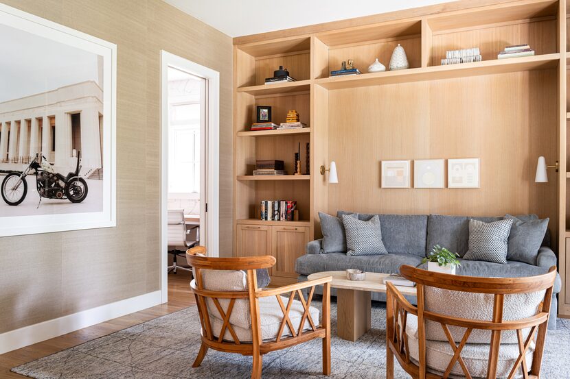
The family also makes daily use of the adjacent library, which doubles as a media room where the couple can snuggle in with their daughters to watch TV or enjoy movie night. “We all hang out in there,” says Pearl. “You can see what’s going on outside, and everyone seems to gather on the same sofa.”
To create a cozy sanctuary, she covered the walls with grass cloth and used white oak for the built-in bookcases. When closed, gauzy window treatments let in filtered light while still offering privacy, and two conical white sconces from Etsy illuminate the sofa nook in the evenings.
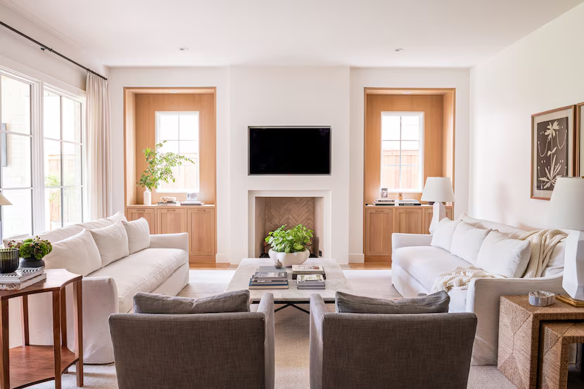
The formal living room is more often used when the couple have company over. Pearl designed the fireplace as her starting point, incorporating a subtle plaster technique on the surround to make it appear set back into the wall. She arranged two white sofas from Rowe across from each other and added a pair of custom armchairs to provide ample seating.
Instead of traditional bookcases, the designer placed windows on either side of the fireplace to flood the room with natural light. “Houses can be so dark,” says Pearl, who appreciates the aesthetic of older homes, which often had extra windows to promote air flow. The main living room wall is likewise comprised of oversized windows, flanked by understated drapery from JF Fabrics.

The living room opens to a spacious and functional kitchen, with added storage in a large center island and countertops of White Macaubas quartzite from Walker Zanger. After designing several all-white kitchens for clients, Pearl wanted something different for the cabinetry in her own home without going to extremes. “I’m not a bold, bright, pop-of-color person,” she says, adding that the French gray-blue cabinetry complements the home’s subdued earthy palette.
Having previously worked as a designer at Bulthaup, a high-end kitchen cabinetry and systems manufacturer, Pearl leans toward a more minimal aesthetic. “Nothing lives on the countertops,” she says, and the microwave and small appliances are neatly hidden inside a pocket door cabinet. “We call it our appliance garage,” Pearl quips. Extra tall upper cabinets seated on the countertop maximize storage space, while custom-designed drawer inserts provide plenty of room for cutlery and utensils.
The designer chose white subway tile from Fireclay as a backsplash for the custom range hood, which is the star of the show in the kitchen. The plaster hood echoes the finish on the fireplace directly across on the far end of the living room. Windows on either side of the stove create a visual break on the large wall, and Pearl added Thomas O’Brien art lights above each one to contrast with the vertical lines of the tile.
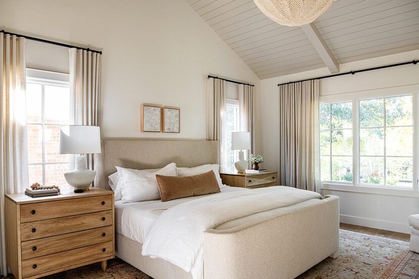
The muted palette carries through upstairs in the primary bedroom, which is a bright and airy refuge from big city life. She chose a knobby, textural material for the custom bed frame and simple ivory bedding from Bovi, noting that the lack of bold shades makes the room very relaxing. A large window captures the pretty views in the front of the house, and unlined linen window treatments let in maximum daylight. At bedtime, a woven Quinn chandelier from Palecek fills the space with a dappled glow.
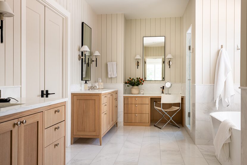
In the master bath, Pearl emphasized symmetry by placing matching light wood vanities with Walker Zanger Bianco Bello marble countertops across from a large soaking tub by Jacuzzi and an enclosed shower. The walls, doors and ceiling all are painted Natural Cream by Benjamin Moore for subtle continuity, she says.
Although Pearl took great care to design a calm and comfortable space that is well suited to her family, she already is dreaming up ideas for the couple’s future home. “We’ll probably stay in this house until the girls are in high school, but it won’t be my forever home,” she says. Her creative nature gets the best of her, Pearl admits, and she is always looking for a new challenge. “Even a year after we moved in, I thought, ‘I’d do another one.’”
Love homes, design and real estate? Get more good stuff from Abode by following us on Instagram and Facebook.
