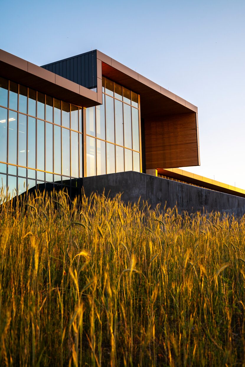
Like raindrops on roses and whiskers on kittens, the new Singing Hills Recreation Center is one of my favorite things, and the finest work of public architecture produced in this city during the pandemic. An unapologetically modern design, it joins the rigid discipline of an Austrian naval captain and the optimistic warmth of a nun-turned-governess with a taste for the outdoors.
The $10.5-million, 25,000-square-foot facility, which opened in January, is something good whether you are going on 16 or going on 65, with a basketball court, community facilities and a separate senior center, all under a single roof.
The design, by the Dallas office of Perkins and Will, delivers sophisticated architecture to an area of the city that is typically ignored. The landscape is the work of Kevin Sloan, whose advocacy for native, sustainable planting is realized here, albeit on a small scale.
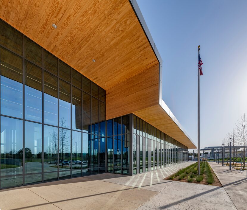
“It’s a beacon” says Ron Stelmarski, principal with Perkins and Will and the lead architect on the project. “We’re hoping it brings people down to southern Dallas.”
It should. The center is perched on a limestone bluff, and looks out over a grassy slope cut by a concrete retaining wall. Arriving by car, the building unfolds dramatically along a looping drive that leads from the slope’s base up and around to the top of the ridge, offering a series of changing perspectives of the building.
But you don’t have to arrive by car for a winning arrival sequence. The best overall view of the center might just be from the platform of the Camp Wisdom rail station on DART’s blue line, making it a convenient spot for commuters before or after work. The center is directly adjacent to the station, separated from it by a handsome public plaza that can be used for outdoor performances and gatherings. “You want every side to be a front,” says Stelmarski. “It doesn’t really have a back.”
The lines of the facility are as clean and straight as a formation of well-drilled child singers; a long horizontal bar broken only at its center by a double-height entry atrium. The south and east façades, facing the rail stop and the parking lot respectively, are defined by vertical gray metal panels and matching windows, giving the composition an alternating Do-Re-Do rhythm.
The details are handled deftly: Instead of setting all of the elements flush, the frames of the metal panels are pushed slightly forward, adding a bit of visual contrast and shadow-play to the proceedings. Where opacity is required to shield mechanical rooms, there is white Texas shellstone, imprinted with the state’s fossil history.
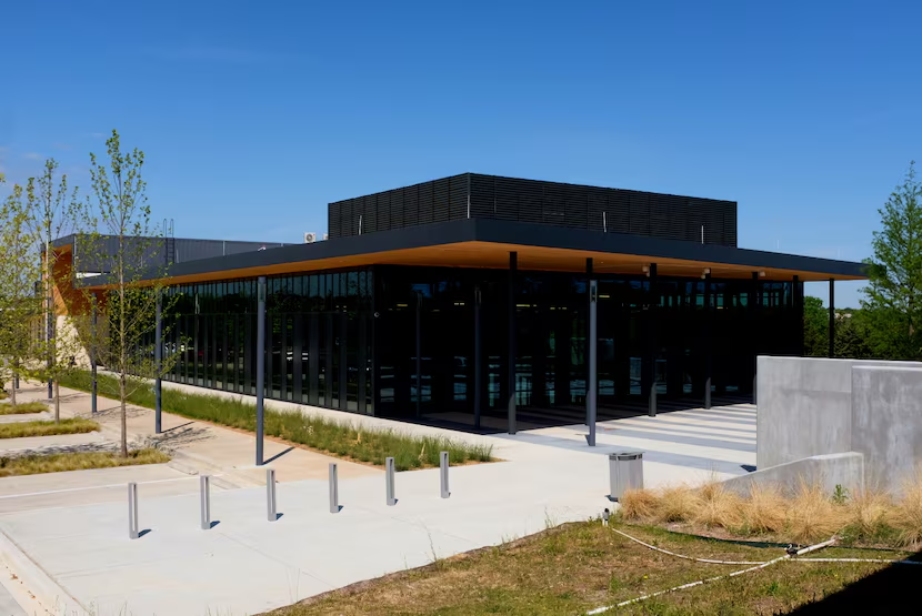
Above, the roof slides out over the wall-plane, creating shaded space along the edges of the building. The underside of that overhang is lined in southern pine that gives the otherwise monotone building a sense of caramel-hued warmth.
Visitors to the center are greeted by a rather mod white circular information desk in the dramatic entry atrium. Below, there is white terrazzo flooring; above, the southern pine slat-ceiling is lit by pin lights on exposed steel cross-framing. Broad windows look out over the sloping hill and toward the Dallas skyline. It is a decidedly modern space in a decidedly modern building, and a reminder that we should say “so long” and “farewell” to those who promulgate the tired trope that modern architecture is inherently frigid and inhumane. Here, the aesthetics are as pleasing as a brown paper package tied up with string.
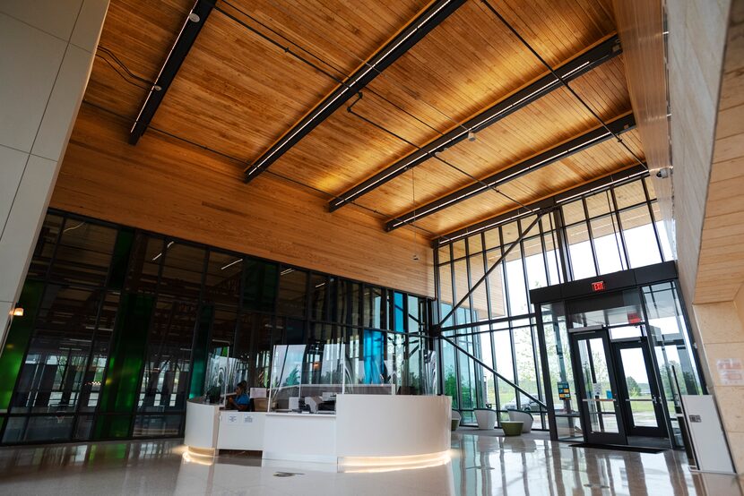
“People walk up and come in and say, ‘Ahh, this is so pretty’,” says Valerie Thomas, who supervises the facility for the Park and Recreation Department.
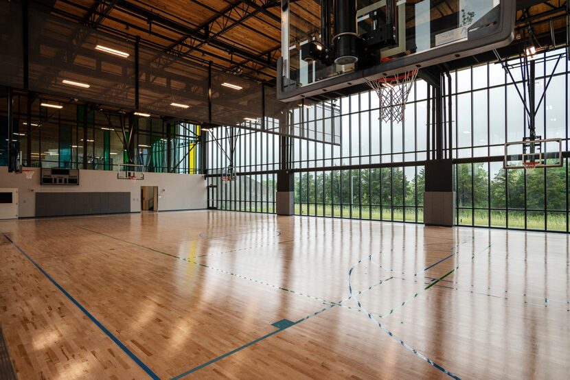
The center’s show-stopping space is its basketball court, which is depressed into the slope with its floor one level below the rest of the facility. On the down-slope side, a floor-to-ceiling window wall looks out over a lush tree canopy. On the opposite side is a grandstand that takes advantage of this view. (If there is any criticism here, it is the potential for glare on the court during games.)
Sinking the court was shrewd architecturally, as it allowed the center to maintain a single roofline, reducing its overall scale while conveying a sense of unity.
Other spaces of the center are set off a double-loaded corridor that narrows as it moves away from the lobby, creating a false perspective that gives an added sense of depth.
Among the facilities are a pair of large multipurpose meeting rooms that can be joined and are serviced by a teaching kitchen. There is a fitness room (while doing your exercises, you can look out across the treeline to the downtown skyline in the distance), a computer room with 16 Mac workstations, and even a digital editing studio where you might work on an album from the family songbook.
The senior center is at the far end of the hall, with a private entrance to the outside and a wraparound terrace for outdoor seating. “They get more of a quiet side to themselves,” says Stelmarski. The interiors here are domestic in nature: a comfortably appointed living room, and gaming area with a ping-pong table.
Searching for smart, transit-oriented development in Dallas can leave you feeling like a lonely goatherd climbing an endless mountain. But the fact that the city is the client for such a thoughtful project is reason for optimism, and a sense that the city is beginning to find ways to escape the trap of its own history. And for the moment, the center at Singing Hills hits all the right notes.
