A pair of recently completed projects in Houston, contrasting in virtually every way yet each one elevating the ritual of experiencing the visual arts, neatly illustrate the shifting priorities and values within the field of architecture over the last few years.
The more dramatic of these, and radically so, is the new Nancy and Rich Kinder Building of the Museum of Fine Arts, Houston. It is, unabashedly, a work of “starchitecture”: a signature, object-building designed by a singular (white male) genius at enormous cost — the putative genius here being Steven Holl, working with a budget of nearly a quarter-billion dollars.
“He’s a sculptor with space,” says Gary Tinterow, the museum’s director. “He has a marvelous sculptural sensibility.”
This is, to be frank, the kind of architecture that is rather outré right now, as the profession has tried to recast itself as more modest, contextually driven, environmentally attuned (at least in theory), diverse (baby steps here), socially responsible (sometimes) and reflective of the collaborative nature of contemporary practice.
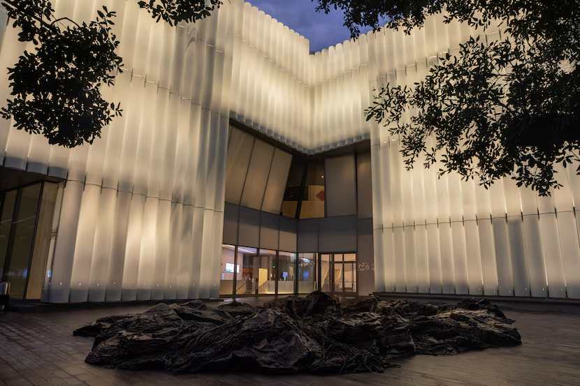
And yet there’s this: The Kinder is a wonder, a gorgeous, glowing object that transforms itself over the course of the day and into the night, and makes the process of looking at art a sheer pleasure.
Holl, who is based in New York, won the project in 2012, beating out two other name-brand firms, Morphosis and Snøhetta. Back then, he was a perennial dark horse for the Pritzker Prize, but with the discipline’s evolution his name is no longer invoked as a serious candidate for that honor. Whether he should be reconsidered, or whether the whole prize should just be canned as obsolete, is a matter you can ponder over cocktails, and the stronger the better.
Holl emerged as a magnetic force within the profession in the late 1980s, a philosopher-architect who spoke poetically (if somewhat abstrusely) of the phenomenological qualities of buildings, and illustrated his work with lovely drawings that seemed closer to Paul Klee than Paul Rudolph. Before he had built much of substance, he was given a solo exhibition at the Museum of Modern Art in New York.
Among his key early works is the 1992 Stretto House in Dallas, an unapologetically avant-garde assemblage of ideas inspired by and responding to both a composition by Béla Bartók and the flows of an adjacent stream.
That kind of pretension has not always endeared Holl to critics, and there is a cohort who have found his work willful and overly obsessed with form over function. And sometimes, those complaints are valid. In 2019, for instance, his multilevel Hunts Point Library in Queens, New York, turned out to be an accessibility nightmare.
But when Holl is good, he can be very, very good. His sympathetic 2007 addition to the neoclassical Nelson-Atkins museum in Kansas City is among the most sensitive museum expansions of the last two decades. Upon completion, it was celebrated as both “breathtaking” and a “perfect synthesis of ideas” in The New York Times.
No doubt, that project impressed the MFAH board when they were looking to hire an architect for a new building. They actually got two. Holl’s proposal stood out because it buried the required parking underground, a move that allowed for a more open, campus-like environment but dramatically increased costs and required the replacement of the museum’s adjacent Glassell School of Art, a glass-block icon that faculty considered obsolete.
Despite the anguish of preservationists, the plan went ahead, and Holl’s remade Glassell School, a study in angular planes of precast concrete, opened in 2018.
Holl’s Nelson-Atkins addition was notable for its deferential modesty. The Kinder Building is in no way modest. It is an audacious, luminous statement, one that competes for attention (and wins, deservedly and unreservedly) with the museum’s two other signature buildings: Mies van der Rohe’s restrained Caroline Wiess Law Building (1974) and Rafael Moneo’s unremarkable and hulking Beck Building (2000).
What makes the Kinder so dramatic, at least from the outside, is its skin of white glass tubes. It is wrapped in 1,170 of them, varying in height, each one a semicircle attached to the concrete core of the building. In the hot sun, they are a bright, opaque white. As dusk approaches, they start to become translucent. By nightfall, the building is a giant phosphorescent lantern. Few buildings change in nature so radically, or so beautifully.
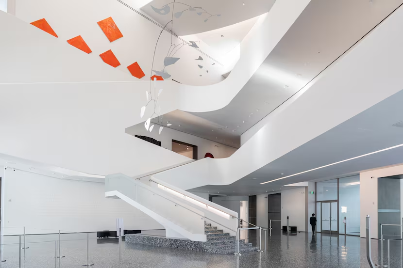
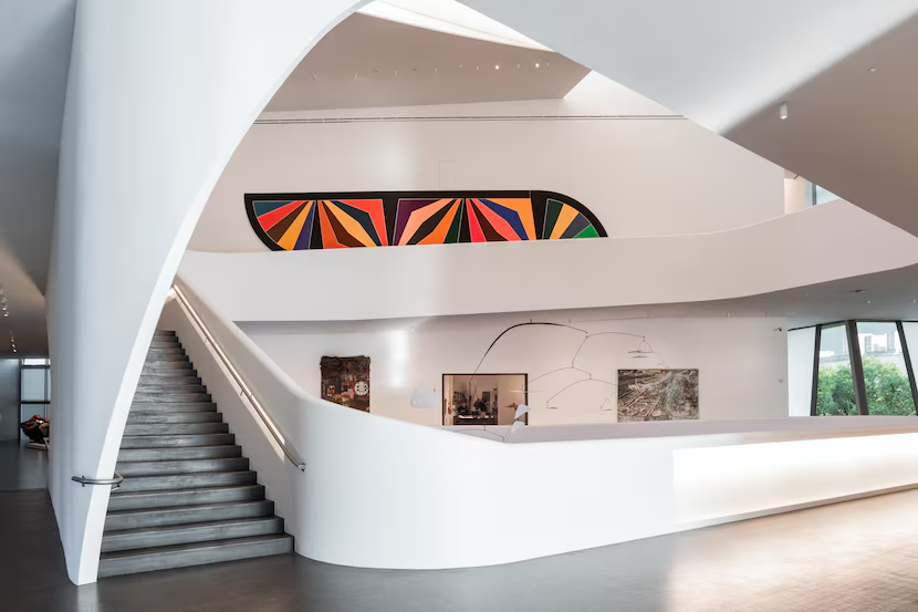
Upon entry, that exterior gives way to a limpid central atrium that is somewhat reminiscent of Frank Lloyd Wright’s Guggenheim. There is no spiral ramp, but the open galleries ring the space above. Instead of Wright’s skylight, the space is capped by wispy, overlapping white panels. “From the beginning, he spoke about big cumulus clouds in the Texas sky,” says Tinterow. “The roof of the Kinder Building is meant to reflect that.”
A Bartók composition. Texas clouds. If that kind of pretension tests your patience, you will find more to irritate you at the Kinder. Holl can be a fussy designer, and his taste reveals itself in details that can be either smart and simple (bespoke door handles) or needlessly assertive (the wrapping superstructure of a stairwell; endless recessed lighting).
My suggestion: Cut Holl some slack, because the rewards are well worth it. The Kinder was commissioned because the museum did not have adequate space to display its growing collection of modern and contemporary art. Now, it has enough to show some 1,500 works, and in galleries that are truly exceptional.
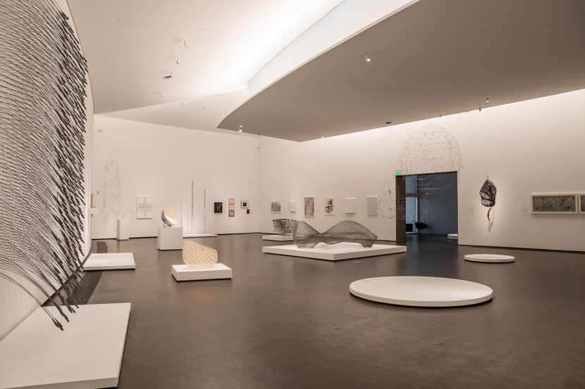
Holl’s luminous facades suffuse the building with light, but the absence of windows in the gallery spaces leaves them glare-free. Notches cut into the building’s facade bring light into the core, creating what Holl calls a “porosity.” Within the galleries, light is controlled from above, pricking out of flanges in the ceiling. The floors are a dark Belgian oak, providing contrast to the white walls. (In the atrium, there is speckled terrazzo, a nod to Mies’ Law Building.)
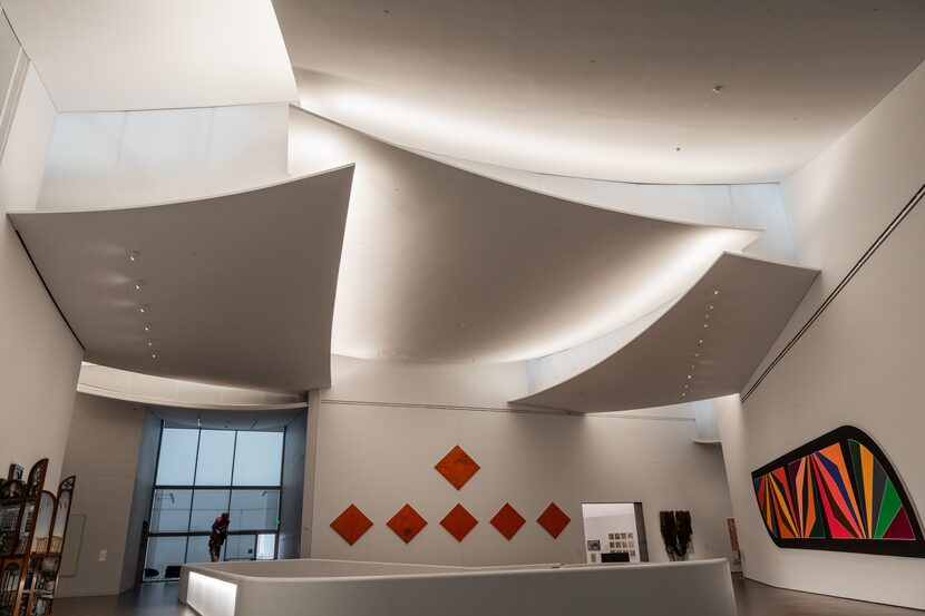
What is most refreshing about Holl’s galleries is their idiosyncrasy. They vary in scale, in shape, in openness and in intimacy, accommodating both a variety of works and viewer experiences. (Much credit here belongs to structural engineer Guy Nordenson, who worked with Holl on the complex truss system that makes those spaces possible.) They are also conveniently and logically linked. Framing is handled with assurance both physically (gallery entries are lined in steel plate) and visually (view corridors link space to space). There is plenty of circulation space, meaning visitors are never jostling like passengers on a rush-hour subway.
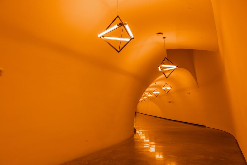
Two of the Kinder’s more striking galleries aren’t galleries at all, but tunnels into the building, one from the adjacent underground parking garage and the other linking it to the Law Building across Bissonnet Street. These spaces are installed with light works by, respectively, Olafur Eliasson and Carlos Cruz-Diez. The idea with these two projects, as with an earlier James Turrell light work that links the Law and Beck Buildings, is to take what would ordinarily be a tedious passage and turn it into a genuinely perception-shifting experience.
They do so successfully (I prefer the Cruz-Diez; the Eliasson feels a bit like being caught in a bug zapper) and equally serve as a metaphor for the Kinder generally, which manipulates light and space in its own transformative manner.
Back to life
As at the Kinder, the management of light and space was the goal for the renovation of the Rothko Chapel, a building that stands as its diametric opposite.
While the Kinder glows from within, preening for your attention, the Rothko Chapel is a discreet and unadorned brick block that makes few claims on your attention. The focus, instead, is within, where it is a quasi-religious space oriented around 14 blue-black paintings by the abstract-expressionist Mark Rothko. The building, which opened in 1971, was the work of the Houston architects Howard Barnstone and Eugene Aubry, although the design grew from an earlier proposal by Philip Johnson, who left the job over disagreements with Rothko.
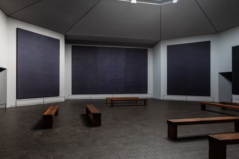
From its earliest days, the chapel has been a pilgrimage site for adherents of Rothko’s absorbing canvasses (I am one), although I will admit the place had always left me cold — poor eyesight and the dim conditions combining to drain the life out of Rothko’s exceedingly delicate panels. In recent years, I’d heard similar complaints from those without my own optical challenges. The cause: a gradual deterioration of the building, and a gumming up of its central skylight.
This was the difficulty faced by Architecture Research Office (ARO), the New York-based firm commissioned to resuscitate the chapel and create a visitor and administrative complex for it across Sul Ross Street and down the block from the Menil Collection. The budget for the first phase, including the chapel restoration and a welcome center, was $16 million.
ARO’s previous work includes the restoration of Donald Judd’s home and studio in a cast-iron building in New York’s SoHo, a project that established the firm’s ability to effectively deal with the display of minimalist artwork in the face of challenging preservation demands.
It is something of a model practice, named the national firm of the year by the American Institute of Architects in 2020, the award reflecting what the AIA called its atmosphere of “collaboration and shared ideas.” The firm’s name is somewhat anonymous, and its work has no defining look, although its two founding principals, Stephen Cassell and Adam Yarinsky, both spent their early years in the office of an architect with a very distinctive personal style: Steven Holl. (They have since added a third principal, Kim Yao.)
No grand moves announce the renovations here, although there have been changes to the landscaping, by Virginia-based Nelson Byrd Woltz, that open the space up more clearly to the street. The plaza that fronts the chapel, defined by its reflecting pool and Barnett Newman’s Broken Obelisk, has been cleaned up and remade with darker pavement that creates less glare. Failing bricks and mortar in the chapel’s exterior walls were replaced, though most visitors will never notice those changes.
What they will notice is Rothko’s magnificent paintings, which are now alive, their quiet force exerting itself once again in their skylit hexagonal sanctuary. As the quality of light outside changes — a cloud floats overhead, the sun declines — so do Rothko’s paintings, their rich blues and purples breathing like living beings.
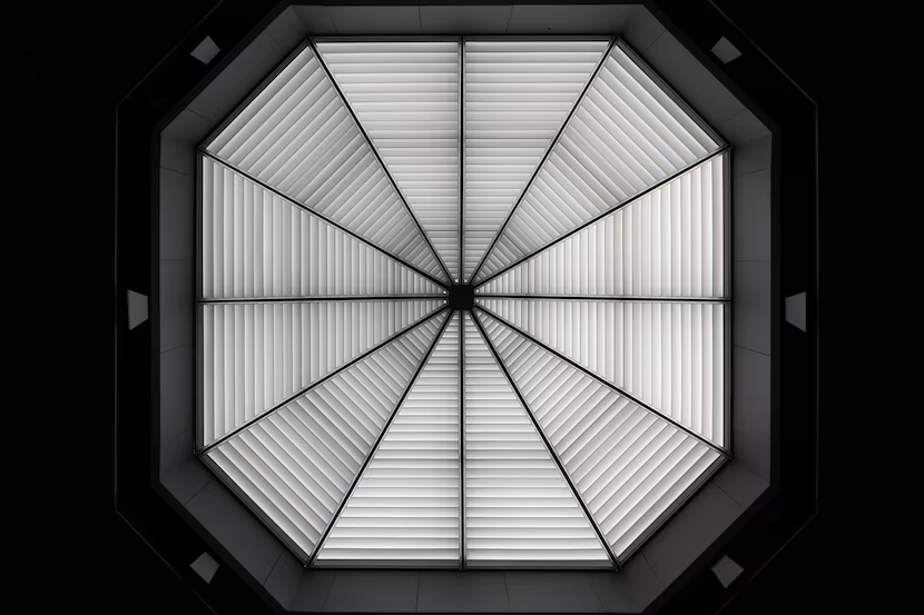
To create such simplicity required a great deal of hidden complexity. The skylight was completely remade, with a complex light-diffusing assembly to keep direct light off the paintings. The natural light is augmented by light from digital projectors concealed around the lip of the skylight, allowing for a controlled environment at any time of day.
The restoration project revealed deeper problems: behind coats of paint and plaster, the chapel’s unreinforced concrete interior walls were crumbling. To stabilize them, slots had to be drilled down the full length of 25-foot high walls to make room for rebar, those slots then painstakingly re-filled with grout.
Because even the most subtle details matter in viewing the panels, the architects moved the entire apse wall of the chapel forward by 6 inches, the slight adjustment creating a visual gap between the shadow from the sofit above and the top edge of the painting.
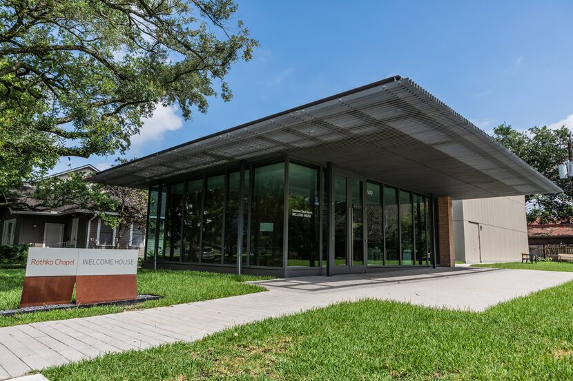
With these alterations, a visit to the chapel is once again — or perhaps for the first time — a revelatory experience. Your journey, now, begins across the street in ARO’s tidy new Suzanne Deal Booth Welcome House, a handsome glass-fronted pavilion shaded by a wooden trellis. An administration and archive building and a multipurpose events building, all of a similar domestic scale and in tune with the bungalow surroundings of the Montrose neighborhood, will eventually be added, forming a three-sided courtyard facing the street.
In the modesty of its forms and its practitioners, it is a project that seems very much in the spirit of the moment. Which is to say, sometimes, a big statement can be small.


